
Google’s 2015 “Mobilegeddon” announcement changed everything about website building by giving priority to mobile-friendly sites in search rankings. Mobile users now make up most website visitors. Building separate designs for each device no longer makes sense with countless screen sizes and resolutions available today.
Responsive web design goes beyond simple screen adjustments and image resizing. Ethan Marcotte introduced this design approach in 2010. Responsive Design Philosophy:
This approach is rooted in the use of fluid grids, scalable images, and CSS media queries to create layouts that dynamically adjust to various devices and screen sizes.
This piece will show you what responsive web design means and how it works. You’ll learn the key techniques to implement it properly. The guide covers viewport meta tags, modern CSS layout methods, and helps you build websites that work perfectly on every device.
What is Responsive Web Design?
Understanding Responsive Web Design (RWD):
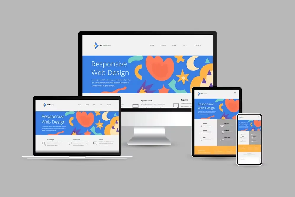
RWD ensures that websites render and function properly across all devices—from small smartphones to large desktop monitors—by adapting their layout based on screen dimensions. Ethan Marcotte introduced this concept in 2010. The design philosophy helps websites adapt to the viewing environment and delivers a great user experience whatever device people use.
Definition and Core Principles
RWD creates websites that change their appearance based on screen size and device orientation. Developers use a single codebase that responds to the user’s environment instead of building separate sites for different devices. This solution emerged because people started accessing websites from many different devices.
Adaptability stands as the core principle of responsive design. Websites naturally adjust their layout to give the best viewing experience on desktop monitors, tablets, or smartphones. The same HTML serves all devices while CSS controls how pages appear on each screen size. This approach became vital as mobile users grew to dominate website traffic.
How Responsive Design Differs from Static Design
Static websites use fixed layouts with elements at exact pixel positions. Responsive designs create flexible layouts that adjust based on screen size. This key difference makes responsive sites work better across devices.
The comparison shows:
| Static Design | Responsive Design |
|---|---|
| Fixed width and layouts | Fluid layouts that adapt to screen size |
| Separate mobile version needed | Single codebase for all devices |
| Positioned with absolute units (px) | Uses relative units (%, em, rem) |
| Requires horizontal scrolling on small screens | Content automatically reflows to fit |
| Difficult to maintain multiple versions | Easier maintenance with one codebase |
Responsive designs avoid tying layouts to specific devices. They use breakpoints to change layout based on viewport width. This makes them ready for future screen sizes without needing complete redesigns.
The Three Pillars: Fluid Grids, Flexible Images, and Media Queries
Three key components work together to create adaptable layouts in responsive web design:
- Fluid Grids: Percentage-based widths replace fixed pixel values. Layout elements scale with screen size. Elements sized in relative units maintain proper proportions as the viewport changes.
- Flexible Images: Images use relative units to stay within their containing elements. Setting
max-widthto 100% lets images scale down for smaller screens without growing past their original size. This prevents distortion and ensures proper display on all devices. - Media Queries: These CSS features apply different style rules based on device characteristics. They detect viewport width and let developers set breakpoints for layout changes. To name just one example, a design might show three columns on desktop but stack them on mobile.
Media Queries – Beyond Screen Size:
Media queries are not limited to screen width. They can also respond to orientation (portrait or landscape), display type (such as print or screen), and user input capabilities (like touch or mouse pointer). These tools create truly responsive experiences.
These three pillars help create websites that look good and work well on any device that connects to the web today.
Setting Up the Foundation for Responsive Design
Building a responsive website needs the right foundation from the start. Your design might break or work poorly on different devices without proper technical setup. Let’s look at what makes responsive design work.
The Essential Viewport Meta Tag
The viewport meta tag stands as your first crucial step to create responsive websites. This HTML element tells browsers how to handle page dimensions and scaling:
<meta name="viewport" content="width=device-width, initial-scale=1.0">This line of code tells browsers to match the viewport width with the device’s screen width and set the zoom level. Mobile browsers usually show pages in a virtual viewport (often 980px wide) and shrink everything to fit the screen without this tag. This defeats the purpose of your responsive design work.
The viewport tag has these key attributes:
width=device-width: Matches the screen’s physical widthinitial-scale=1.0: Sets the initial zoom when the page loadsuser-scalable: Controls whether users can zoom (don’t set it to “no” – it creates accessibility problems)
You must add this meta tag in your HTML’s <head> section to make responsive design work.
Viewport Meta Tag: As highlighted by Google’s responsive design guidelines, the viewport meta tag is a foundational element and should be one of the first components defined in any responsive webpage. It enables proper scaling and rendering on mobile devices. This shows its value for user experience and SEO.
Creating a Flexible Grid Layout
A flexible foundation comes next after the viewport setup. Today’s responsive designs use fluid grids that adjust to screen sizes naturally.
The responsive layout grid needs three main elements:
- Columns: Content placement areas (width uses percentages, not fixed values)
- Gutters, the spacing between columns, help maintain visual clarity and structure. Using consistent, fixed gutter values at designated breakpoints ensures balanced spacing across devices.
- Margins: Spaces between content and screen edges
CSS Layout Tools – Flexbox & Grid:
Flexbox and CSS Grid offer developers robust systems for constructing adaptive layouts. Both enable precise control over spacing, alignment, and content flow.
CSS Grid Approach:
.grid-container {
  display: grid;
  grid-template-columns: repeat(auto-fit, minmax(10em, 1fr));
  gap: 1rem;
}
RAM Technique in CSS Grid:
The RAM method (Repeat, Auto, Minmax) is a powerful pattern in CSS Grid that enables fluid, responsive layouts with minimal code. It allows grid items to repeat automatically within a range of minimum and maximum widths. Columns adjust to available space automatically. Each column stays at least 10em wide but stretches to fill space.
Flexbox Approach:
.flex-container {
  display: flex;
  flex-wrap: wrap;
}
.flex-item {
flex: 1 1 300px; /* Flex-grow, flex-shrink, and flex-basis defined */
}
Items wrap to the next line as needed. They keep a minimum width of 300px while growing to fill space.
Using Relative Units (%, em, rem, vw) Instead of Pixels
Moving away from pixels marks a fundamental change in responsive design thinking. Absolute units like pixels make rigid layouts that don’t work well on different screen sizes and block proper scaling.
Pixels fail for responsive design because:
- They don’t scale with screen size
- They ignore the user’s font size priorities (accessibility problems)
- They stay fixed regardless of container size
Better relative units to use:
| Unit | Relative To | Best For | Example Use |
|---|---|---|---|
| % | Parent element | Layout widths, margins | width: 100%; |
| em | Parent element’s font size | Component-specific scaling | padding: 1.5em; |
| rem | Root element’s font size | Typography, consistent spacing | font-size: 1.2rem; |
| vw/vh | Viewport dimensions | Full-screen elements, fluid typography | width: 50vw; |
rem units work best for typography. They scale with the root font size and keep text readable on all devices. Modern browsers set the default root font size to 16px, so 1rem = 16px. Users can change this in their browser settings – another reason to avoid fixed pixel values.
The clamp() function helps create fluid typography that scales smoothly between screen sizes:
font-size: clamp(1rem, 0.5rem + 2vw, 1.5rem);This sets a minimum of 1rem, maximum of 1.5rem, with a value that adjusts based on viewport width.
These three elements – viewport meta tag, flexible grid layouts, and relative units – create strong foundations for responsive designs. Your sites will adapt naturally across devices and respect user choices.
Implementing Media Queries for Different Devices
Media queries are the foundations of responsive web design that help websites adapt to devices people use today. These CSS features let your layouts change based on screen characteristics. You can create individual-specific experiences without multiple codebases.
Understanding Breakpoints
Breakpoints help your website’s layout change to give users the best experience across different viewport widths. Your content can reflow and reorganize instead of staying fixed-width. This maintains usability on all devices.
A breakpoint represents a specific screen size where the design shifts to a different layout. Designers use this term to describe the screen-size range where a specific layout appears. CSS media queries implement these breakpoints:
@media only screen and (max-width: 600px) {
  /* Styles for mobile devices */
}
You can determine breakpoints in two ways:
- Device-based breakpoints: Set at common device widths
- Content-based breakpoints: Set where your design needs visual adjustments
The content-first method works better since it focuses on your design’s actual needs rather than random device sizes. This approach also keeps your design ready for new devices.
Mobile-First vs. Desktop-First Approaches
Your media query implementation needs a decision between building up from mobile or down from desktop.
Mobile-first starts with styles for smallest screens and adds complexity for larger ones using min-width queries:
/* Base styles for all devices */
.element { width: 100%; }

/* Tablet styles */
@media (min-width: 768px) {
  .element { width: 50%; }
}
Desktop-first begins with the complete desktop experience and simplifies for smaller screens using max-width queries:
/* Base styles for desktop */
.element { width: 33%; }

/* Mobile styles */
@media (max-width: 767px) {
  .element { width: 100%; }
}
Mobile-first produces better results because it:
- Puts content before features
- Creates faster-loading mobile sites
- Matches current trends where mobile usage leads
Desktop-first might work better if your audience mainly uses desktop devices or your site needs complex features that scale down.
Common Screen Sizes and Orientation Considerations
Device categories have influenced the establishment of widely accepted breakpoints across the industry.
- Mobile: 360-480px
- Tablets: 768-1024px
- Desktops/Laptops: 1280-1920px
Most designs use 2-3 major breakpoints to keep development practical.
Screen orientation affects responsive design significantly. It tells whether a viewport is in landscape mode (width exceeds height) or portrait mode (height exceeds width). You can target orientations through media queries:
@media screen and (orientation: portrait) {
  /* Styles for portrait orientation */
}
This helps create layouts that work well in both phone positions without content duplication. Some interactive applications might benefit from locked orientation using the Screen Orientation API for specific content.
These three aspects of media queries help you create responsive designs that deliver great experiences on any device or orientation.
Creating Responsive Elements
Building adaptive websites comes with its challenges, and creating responsive elements tops the list. Your components must work smoothly on all screen sizes to keep your site usable and visually appealing.
Fluid Images and Videos
Images in responsive design must adapt to their containers without distortion or overflow. The [max-width: 100%](https://blog.pixelfreestudio.com/best-practices-for-designing-responsive-design-systems/) setting will make images scale down on smaller screens and prevent stretching beyond original dimensions. This approach is different from width: 100%, which might force images to grow beyond their native size and cause pixelation.
Videos follow similar rules:
video {
  max-width: 100%;
  height: auto;
}
YouTube and other iframe-embedded videos need special handling because they don’t keep their aspect ratios naturally. You can solve this by creating a wrapper with an intrinsic aspect ratio:
.video-wrapper {
  position: relative;
  padding-bottom: 56.25%; /* 16:9 ratio */
}
.video-wrapper iframe {
  position: absolute;
  width: 100%;
  height: 100%;
}
Responsive Typography That Scales
Fluid typography scales have evolved beyond basic breakpoints. The CSS clamp() function handles scaling elegantly:
h1 {
  font-size: clamp(1.5rem, 5vw, 3rem);
}
Headlines and display text benefit from this approach when you need big size differences between mobile and desktop. Body text with minimal size variations works better with traditional responsive typography and breakpoints.
Navigation Patterns That Work Across Devices
Your navigation must balance accessibility, content discovery, and prioritization. Here are some proven patterns:
- Top Navigation Bar: Perfect for sites with fewer navigation options
- Navigation Menu (Hamburger Icon): Utilizes minimal screen space, making it ideal for compact layouts, though there’s a risk that some users may overlook it.
- Tab Bar: Stays visible but works with limited options
- Navigation Hub: Makes homepage the main navigation center
Content-heavy sites work well with hidden menus that put content first. Task-focused sites need more visible navigation options.
Tables and Complex Content
Tables create unique challenges in responsive design. You can tackle them in several ways:
- Scrollbar Approach: Add horizontal scrolling to wide tables with
overflow: auto - Stacking Approach: Turn rows into vertical blocks when you have non-comparative data
- Toggleable Columns: Let users choose which columns to see
Sticky headers with position: sticky help users keep track while scrolling through tables. Remember to use proper table semantics and ARIA attributes to keep your tables accessible to everyone.
Modern CSS Layout Techniques
Modern CSS provides robust layout systems that have changed the way we create responsive websites. Developers no longer need to hack layouts with floats and positioning. CSS now includes dedicated tools that make responsive design more user-friendly.
Flexbox for Responsive Layouts
Flexbox shines at one-dimensional layouts by controlling elements in rows or columns. The layout system handles space distribution automatically. This makes it perfect for responsive components that adapt to different screen sizes.
.container {
  display: flex;
  flex-wrap: wrap;
}
.item {
flex: 1 1 300px; /* Defines growth, shrinkage, and default size */
}
Flexbox’s intrinsic sizing abilities make it valuable for responsive design. The layout calculates content size first, which helps elements respond naturally to their content. You can adjust your layout for smaller screens with media queries:
@media (max-width: 800px) {
  .flex-container {
    flex-direction: column;
  }
}
CSS Grid for Two-Dimensional Layouts
CSS Grid gives you complete control over rows and columns at the same time, unlike Flexbox’s single direction focus. This two-dimensional approach works great for complex page structures.
.container {
  display: grid;
  grid-template-columns: repeat(auto-fit, minmax(200px, 1fr));
  gap: 20px;
}
The repeat(auto-fit, minmax()) function creates a responsive grid that adjusts columns based on available space. This pattern lets items flow from three columns on desktop to a single column on mobile without extra media queries.
Grid’s strength lies in creating sophisticated layouts with minimal code. The parent container controls the layout completely, which differs from Flexbox where children influence their sizing more.
When to Use Each Layout Method
Pick the right tool based on your layout needs:
| Aspect | Flexbox | CSS Grid |
|---|---|---|
| Dimension | One-dimensional | Two-dimensional |
| Control | Child elements have more control | Parent container has full control |
| Use Case | Components, navigation, small-scale layouts | Overall page structure, complex layouts |
| Content vs. Layout | Content-first approach | Layout-first approach |
| Learning Curve | Moderate | Steeper |
Flexbox works best for organizing elements in a line or for alignment tasks. Grid excels at organizing content in both dimensions at once.
Most modern websites use both systems together. Grid handles the overall page structure while Flexbox manages component-level arrangements. This combination creates responsive layouts that adapt naturally across all devices with fewer media queries.
Conclusion
Responsive Web Design: A core methodology in modern web development, responsive design ensures websites automatically adapt and provide an optimal user experience across a wide range of devices and screen sizes. This complete guide explores essential concepts from basic viewport setup to advanced CSS Grid implementations.
Fluid grids, flexible images, and media queries work together to create adaptable layouts that respond to different screen sizes. The proper foundation starts with viewport meta tags and relative units to ensure consistent rendering on devices. Modern CSS techniques like Flexbox and Grid are powerful tools that simplify responsive layouts while keeping code clean and maintainable.
Note that these important points:
- Mobile-first design results in better performance and user experience
- Content should determine breakpoint decisions instead of specific device sizes
- Flexible images and responsive typography keep visual appeal on all screens
- Modern CSS layout systems remove the need for complex responsive hacks
To become skilled at responsive web design takes practice and adaptation to new techniques. Begin with these fundamentals and progress to complex layouts as your skills improve. The web evolves constantly, but these core principles will help you create websites that look and function well on any device.
