

In today’s fast-paced digital landscape, users form opinions about your website in milliseconds. What guides their eyes? What makes them stay or bounce? The answer lies in visual hierarchy — the strategic organization of design elements to indicate their order of importance.
Visual hierarchy is more than aesthetics; it’s the backbone of user experience (UX). When implemented correctly, it leads users effortlessly through your content, ensuring that the most important information gets seen first. Let’s break down why this matters and how to master it.
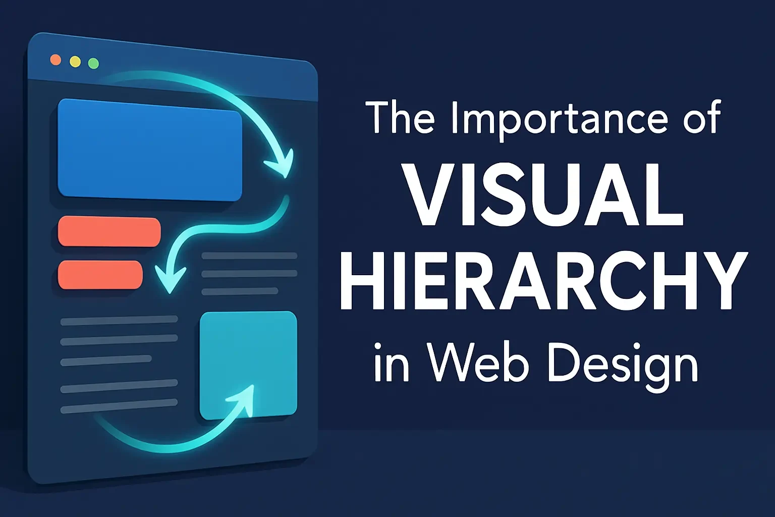
What Is Visual Hierarchy?

Visual hierarchy is the arrangement of elements such as text, images, and buttons to signal importance. It dictates what users see first, next, and last.
Core Principles of Visual Hierarchy:
- Size and Scale: Larger elements command more attention. Use big headings or prominent call-to-actions (CTAs) to lead users.
- Color and Contrast: High contrast and bold colors make elements stand out. Use them to emphasize buttons, links, or critical messages.
- Typography: Vary font sizes, weights, and styles to indicate different levels of importance and guide content flow.
- Spacing and Proximity: Group related elements together and use spacing to give clarity and breathing room.
- Alignment and Layout: Consistency in layout and alignment boosts readability and helps users process information faster.
How Visual Hierarchy Shapes User Experience

A strong visual hierarchy is central to UX design, enabling sites to be intuitive and user-friendly.
Benefits of Effective Visual Hierarchy:
Boosts Engagement: Clean layouts with clear direction keep users engaged longer and lower bounce rates.
Guides User Attention: Users instinctively follow the design flow, discovering key information first.
Enhances Readability: Structured content is easier to read and digest.
Improves Navigation: Users locate what they need without friction or confusion.
Implementing Effective Visual Hierarchy
Let’s look at practical methods to bring visual hierarchy into your design process:
Tactical Design Techniques:
Consistent Styling: Use uniform button styles, icon sizes, and typography across the site to build familiarity and trust.
Use of Grids: Grid systems keep your layout neat and aligned, ensuring uniformity across pages.
F-Pattern & Z-Pattern Layouts: These mirror natural eye-scanning behaviors and increase comprehension.
Whitespace Utilization: White space draws attention to important content and prevents clutter.
Common Mistakes to Avoid
Even experienced designers sometimes overlook these pitfalls:
Ignoring Mobile Design: If your hierarchy doesn’t adjust on mobile devices, your user experience suffers. Responsive design is essential.
Overloading with Information: Don’t crowd the interface. Prioritize what matters most to your users.
Inconsistent Elements: Varying styles for similar elements can confuse users and break flow.
Case Studies and Real-World Examples

Effective Examples of Visual Hierarchy:
- Apple.com: Uses large hero images, minimal text, and sharp contrast to draw attention to products.
- Medium.com: Perfects typography hierarchy for clean, readable articles.
Before & After Success Stories:
- Websites that updated their CTA button size, added spacing, or adjusted color schemes saw up to a 30% increase in conversions.
Conclusion:
Visual hierarchy isn’t just a design theory—it’s a powerful UX tool that helps your users understand, engage, and act. Whether you’re redesigning your site or starting fresh, focus on what your users should see first, and structure everything else accordingly.
