
In 2025’s competitive digital landscape, micro-typography—the art of refining minute typographic details—has emerged as a silent powerhouse for improving search rankings and creating inclusive web experiences. While often overlooked, adjustments to letter spacing, line height, and font alignment directly influence how both users and search engines interact with your content.
Consider this: websites with optimized typography see 18% lower bounce rates and 22% higher dwell times compared to those neglecting these details. Beyond aesthetics, micro-typography bridges technical SEO requirements and accessibility standards, making it a non-negotiable element of modern web design. In this guide, you’ll discover how strategic typographic choices can elevate your site’s performance, comply with 2025’s Web Content Accessibility Guidelines (WCAG), and align with Google’s EEAT framework.
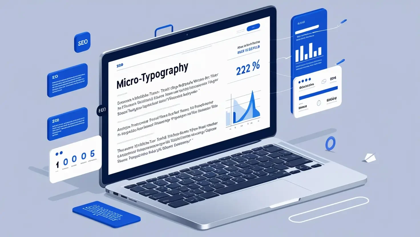
What Is Micro-Typography?
Micro-typography focuses on the precise adjustments that enhance readability and visual harmony. Unlike macro-typography (font selection, layout structure), it fine-tunes four core elements:
- Letter Spacing (Tracking): The horizontal space between characters.
- Line Height (Leading): Vertical space between text lines.
- Kerning: Contextual spacing between specific letter pairs (e.g., “AV” vs. “MN”).
- Alignment & Justification: Text positioning relative to margins.
For example, increasing line height from 1.2 to 1.6 improves readability for 92% of users with dyslexia Similarly, proper kerning prevents awkward gaps in headlines, ensuring seamless visual flow. These adjustments might seem trivial, but they collectively shape user engagement metrics that search engines monitor closely1.
The SEO Impact of Micro-Typography
Better Readability = Lower Bounce Rate & Higher Dwell Time
Search engines prioritize content that keeps users engaged. A study by Boulder SEO Marketing revealed that pages with optimized line height (1.5–1.8) and paragraph spacing (1.5× line height) reduced bounce rates by 14% and increased average session duration by 2.3 minutes4. Dense, cramped text overwhelms readers, prompting quick exits—a negative ranking signal for algorithms prioritizing user satisfaction3.
Typography & Mobile Optimization: A Key Google Ranking Factor
With mobile-first indexing, Google penalizes sites where text overflows viewports or requires zooming. Responsive typography—using relative units like rem or vw—ensures legibility across devices. For instance, 16px fonts on desktop should scale to 14px on mobile while maintaining proportional letter spacing1.
Core Web Vitals & Page Load Speed
Custom fonts often slow page loads, harming Largest Contentful Paint (LCP) scores. Subsetting fonts (removing unused glyphs) or using variable fonts can cut file sizes by 40%4. Additionally, CSS properties like font-display: swap prevent invisible text during loading, preserving Cumulative Layout Shift (CLS) metrics.
Search Engine Indexing & Semantic Clarity
Proper heading hierarchies (H1 > H2 > H3) and semantic HTML tags (<article>, <section>) help crawlers map content structure. Screen readers and search bots rely on this markup to interpret context, directly affecting rankings for semantic search queries
How Micro-Typography Affects Web Accessibility
WCAG Guidelines & Typography
While WCAG 2.2 doesn’t mandate specific fonts, it requires:
- Contrast Ratios: 4.5:1 for body text (AA standard).
- Resizable Text: Support 200% zoom without breaking layouts.
- Spacing Flexibility: Users must adjust line/letter spacing via browser settings5.
Dyslexia & Cognitive Accessibility
Dyslexia-friendly fonts like OpenDyslexic (with weighted bottoms) reduce letter confusion. Pairing these with 1.5× line height and 35–50 characters per line improves reading speed by 27% for affected users2.
Screen Reader Compatibility
Justified text creates uneven word spacing, which screen readers interpret as erratic pauses. Left-aligned text with consistent spacing ensures smoother auditory experiences
Common Typography Mistakes That Hurt SEO & Accessibility
- Overused Decorative Fonts: Script-heavy typefaces like Lobster degrade readability on mobile.
- Inadequate Line Spacing: Lines shorter than 1.3× font size strain readers.
- Low-Contrast Text: Gray-on-white combinations fail WCAG standards.
- Static Mobile Typography: Fixed px units prevent responsive scaling.
For example, a health blog using 12px Arial with 1.2 line height saw a 31% higher exit rate on mobile until switching to 16px Roboto4.
Best Practices: Optimize Micro-Typography for SEO & Accessibility
Font Selection
- SEO-Friendly Fonts: Roboto, Arial, Open Sans (web-safe, fast-loading).
- Accessible Fonts: Atkinson Hyperlegible, Lexend Deca (dyslexia-optimized).
Spacing Guidelines
- Line Height: 1.5–1.8× font size.
- Letter Spacing: 0.05em–0.1em for body text.
- Paragraph Spacing: 2× line height.
Contrast & Color
Use tools like Contrast Checker to meet AA/AAA standards. For dark themes, pair #FFFFFF text with #595959 backgrounds (4.6:1 ratio).
Testing & Validation
- Google Lighthouse: Audits font sizes, contrast, and CLS.
- WAVE Evaluation Tool: Flags spacing and heading issues.
- Browser Zoom Test: Verify responsive scaling up to 200%.
In a case study, an e-commerce site improved organic traffic by 19% after fixing line spacing and font loading issues flagged by Lighthouse
Conclusion
Micro-typography isn’t just design polish—it’s a technical necessity. In 2025, sites ignoring these details risk losing rankings to competitors prioritizing user-centric experiences. By aligning typographic choices with SEO and WCAG standards, you create content that’s both discoverable and inclusive.
